

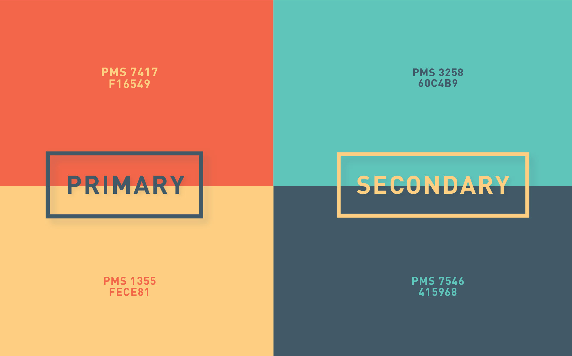
Bunkr Rebrand
Year Completed
2014
2014
Disciplines
Branding & Identity
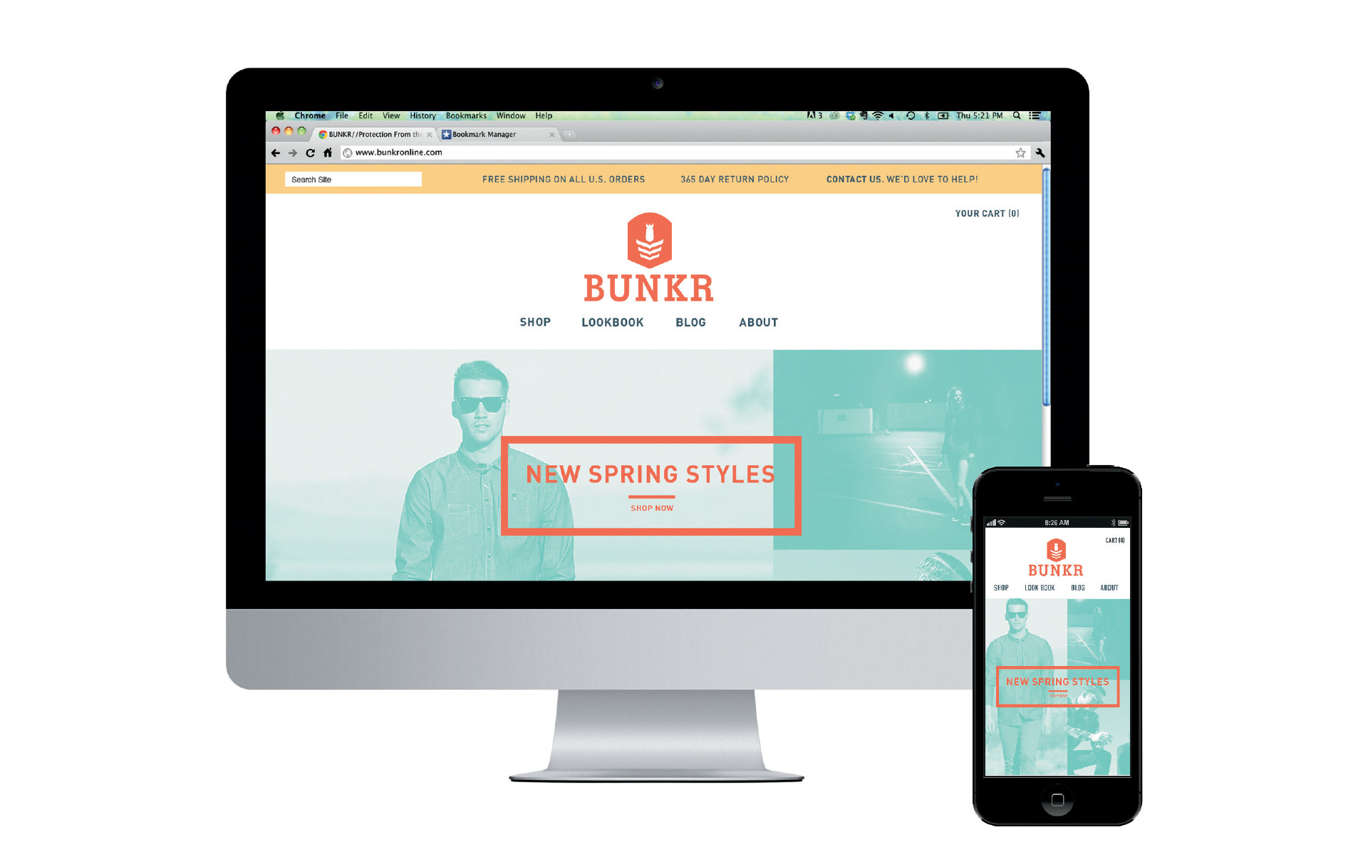
Web Design
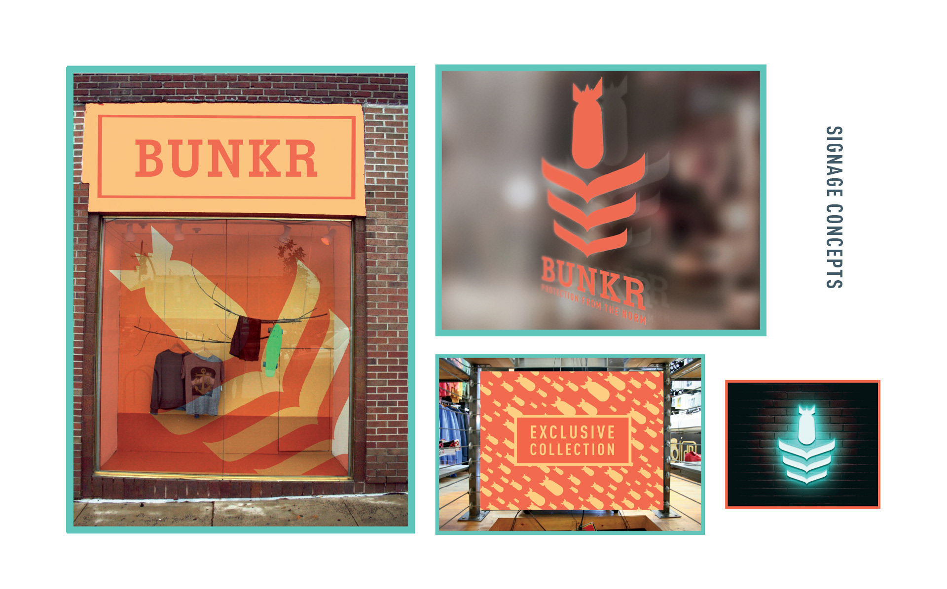
Signage & Wayfinding
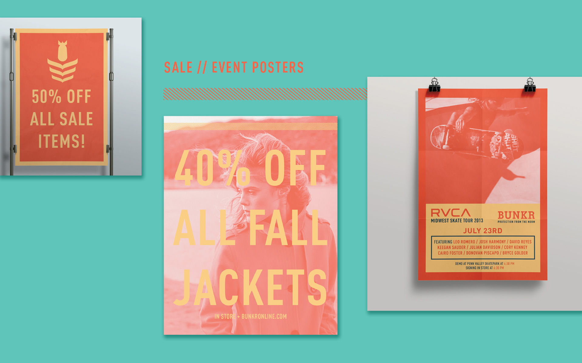
Promotional Advertising
Branding & Identity
Web Design
Signage & Wayfinding
Promotional Advertising
Awards & Recognition
AIGA Kansas City A10 Award
AIGA Member Gallery
Behance Student Show
Canva Design School
AIGA Kansas City A10 Award
AIGA Member Gallery
Behance Student Show
Canva Design School
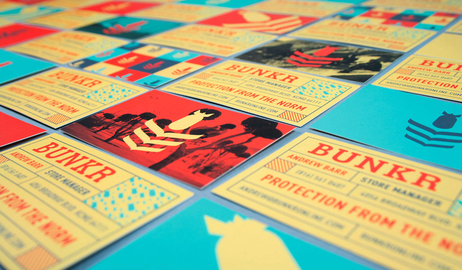
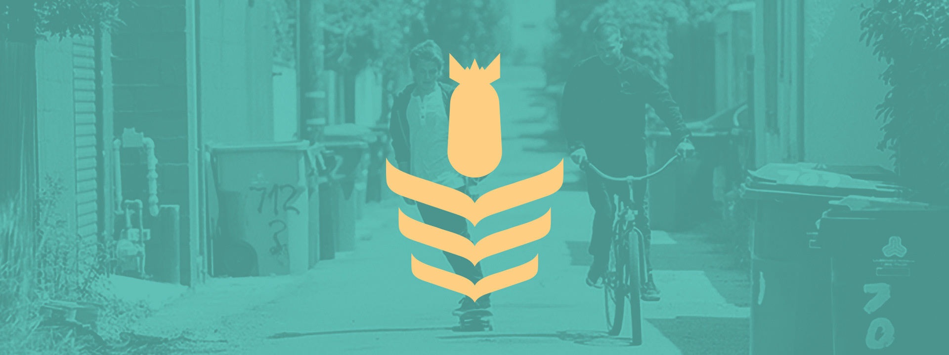
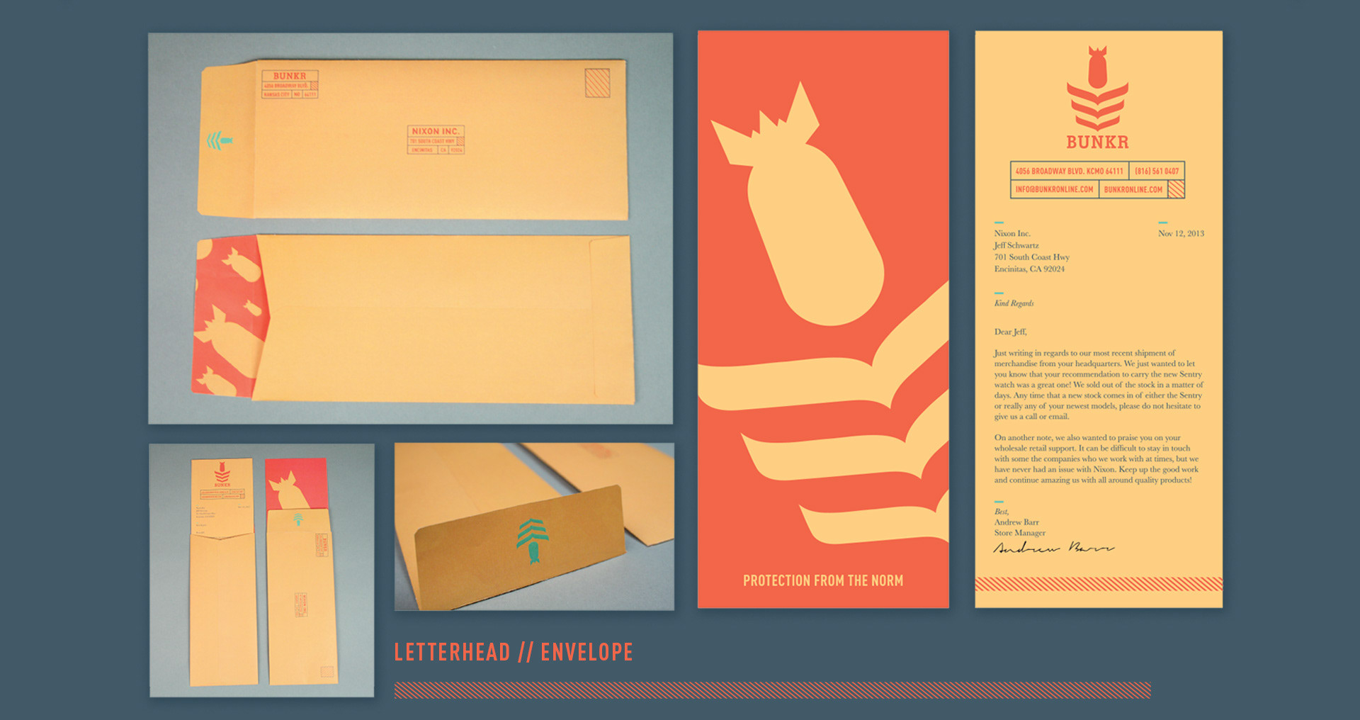
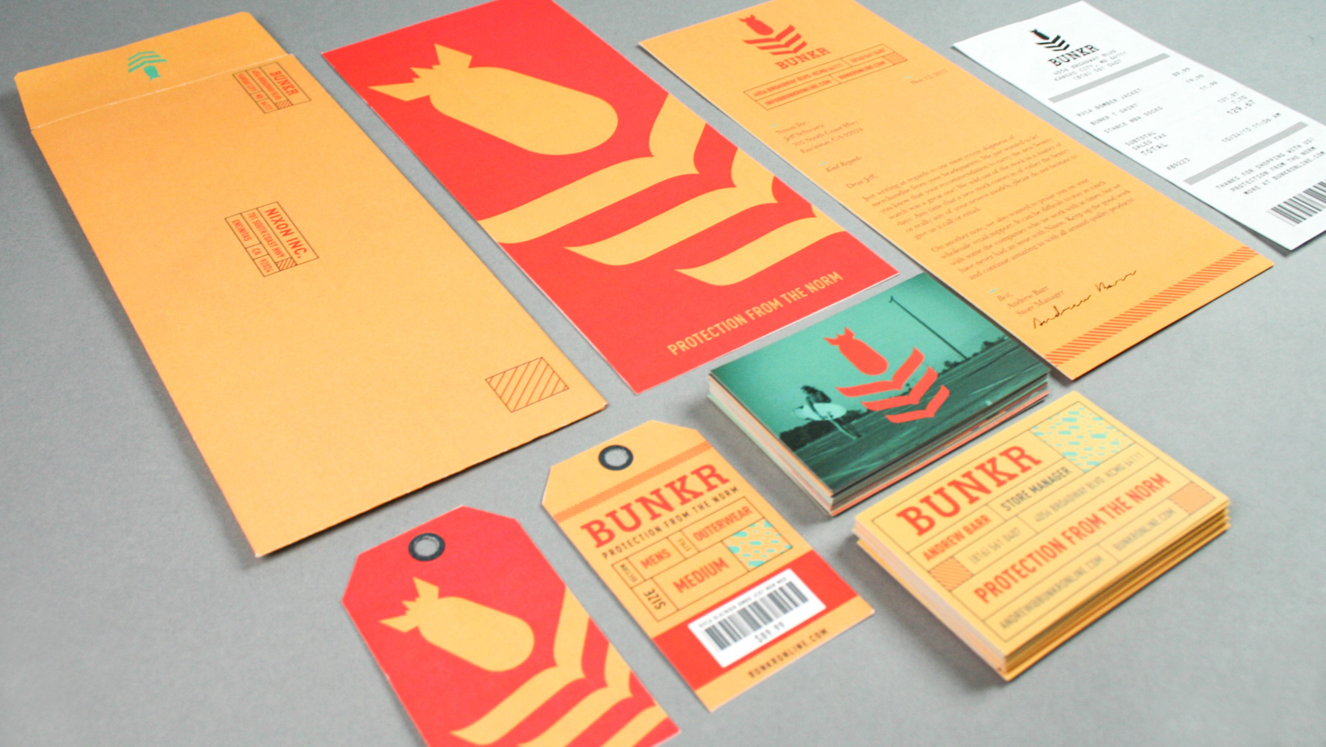
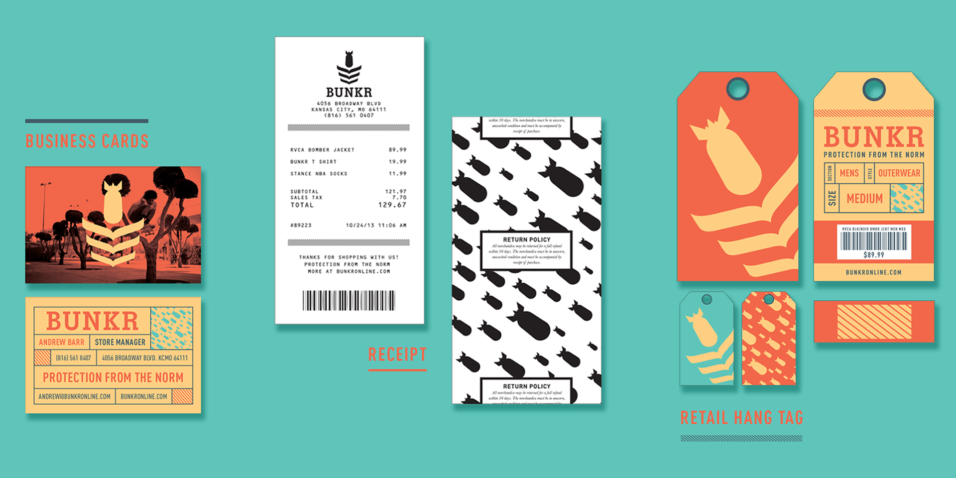
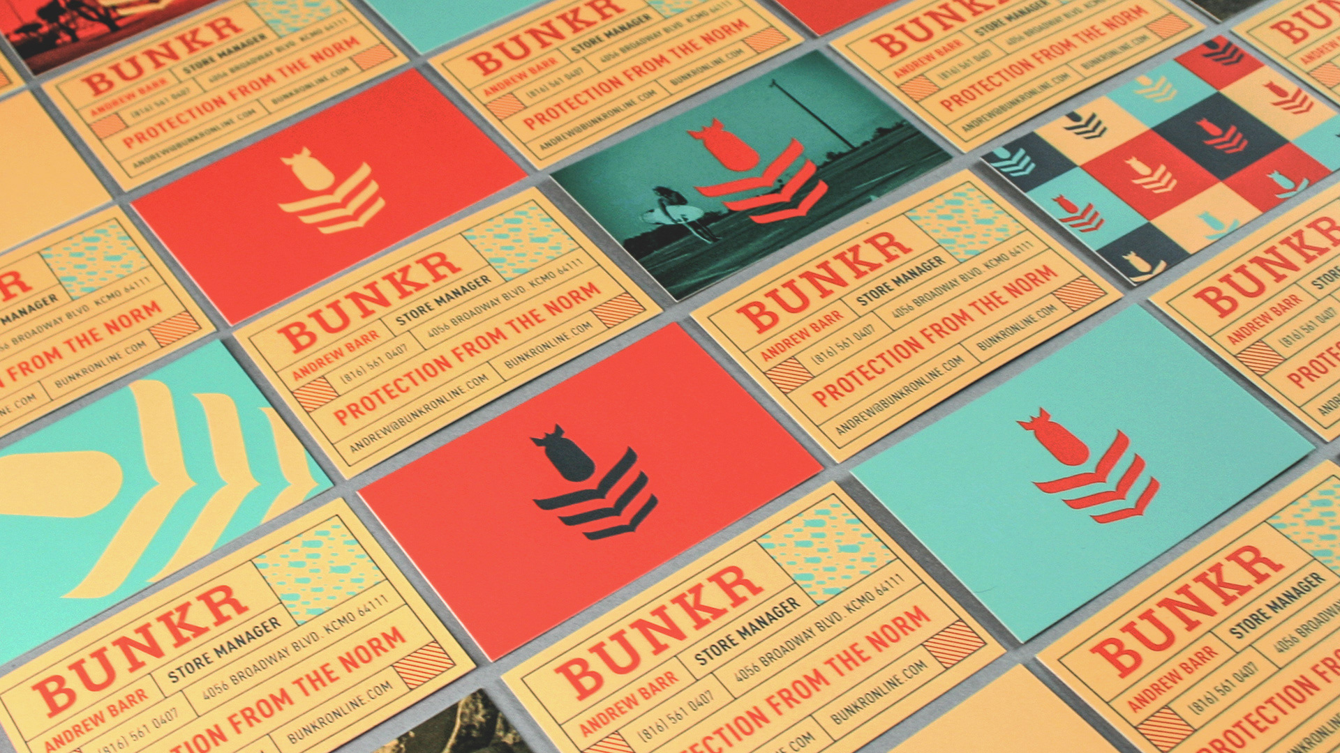
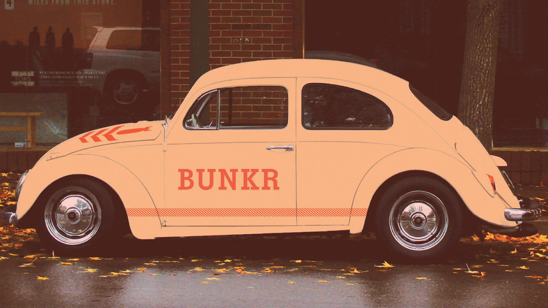
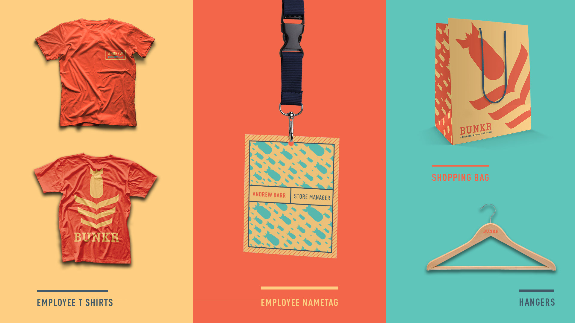
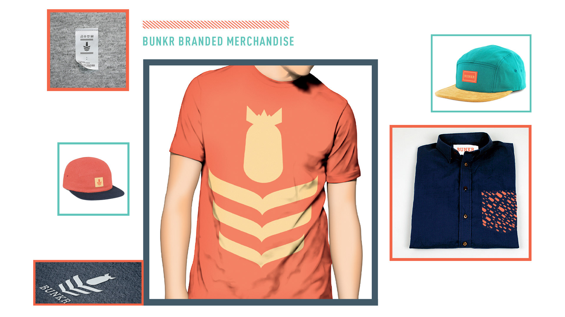
A rebrand proposal for The Bunker, a local lifestyle and apparel shop in Kansas City, Missouri. The overall goal of the rebrand was to develop a cohesive identity system for both the in-store and online shopping experiences. I focused heavily on fully representing the store's morals and beliefs, especially regarding independent style.
This was a hypothetical case study. The system is not currently in use.
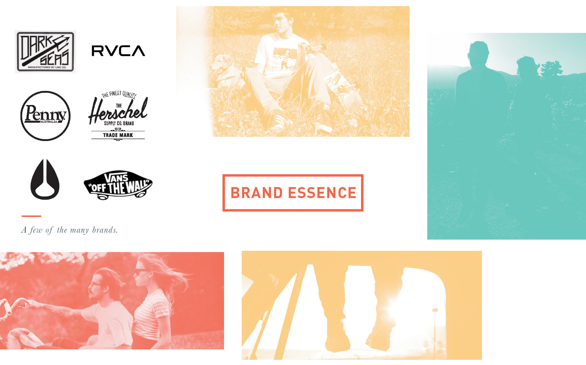
The Bunker is a safe haven from mainstream retail shopping, offering customers hand-picked brands and lifestyle products which promote self expression and discovery of oneself through style.
Taking the brand essence into consideration, I established a set of four attributes to guide the design process:
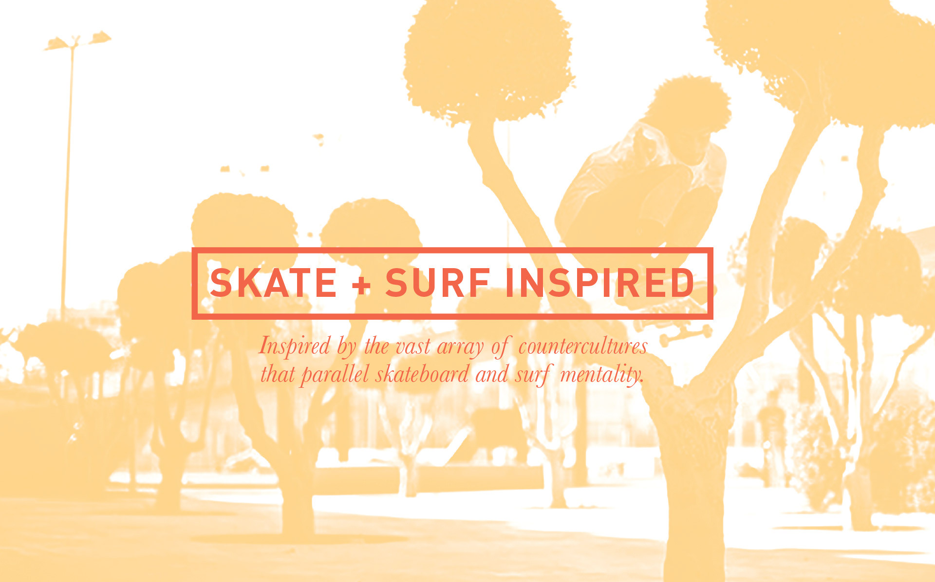
• Expressive individuals who are not afraid to stray from the status quo
• Creative Thinkers
• Independent Style Enthusiasts
• Adventure Seekers
• Those who appreciate quality goods
• Those who live for moments of discovery
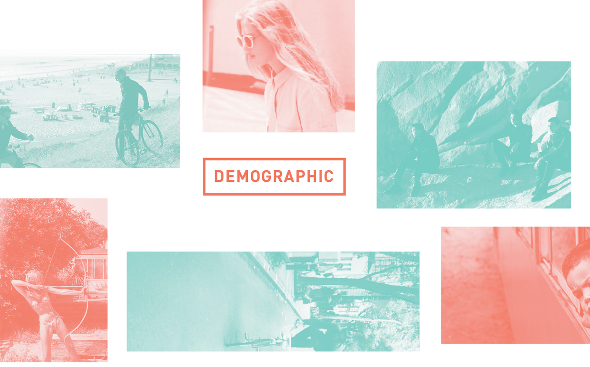
• Focused on millennials, 18 - 32, as a key demographic, but offering something for any age group
• Creative Thinkers
• Independent Style Enthusiasts
• Adventure Seekers
• Those who appreciate quality goods
• Those who live for moments of discovery
• Focused on millennials, 18 - 32, as a key demographic, but offering something for any age group
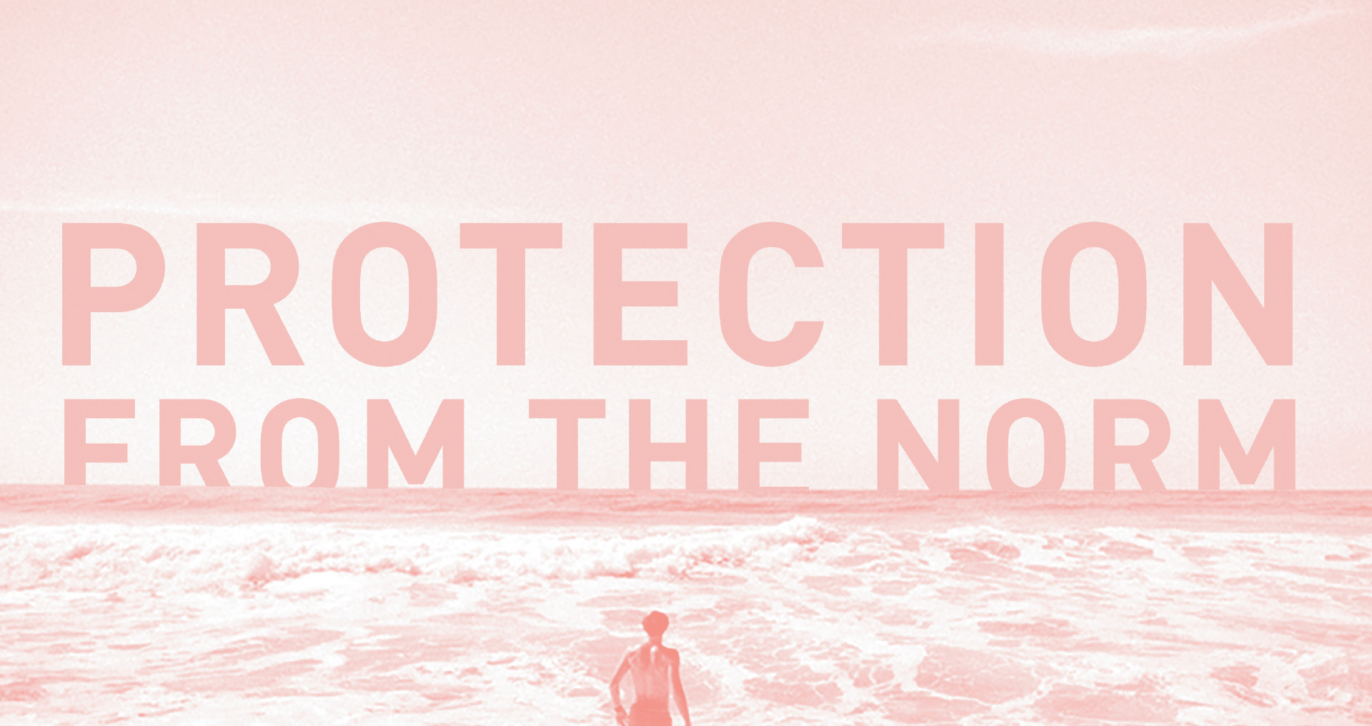
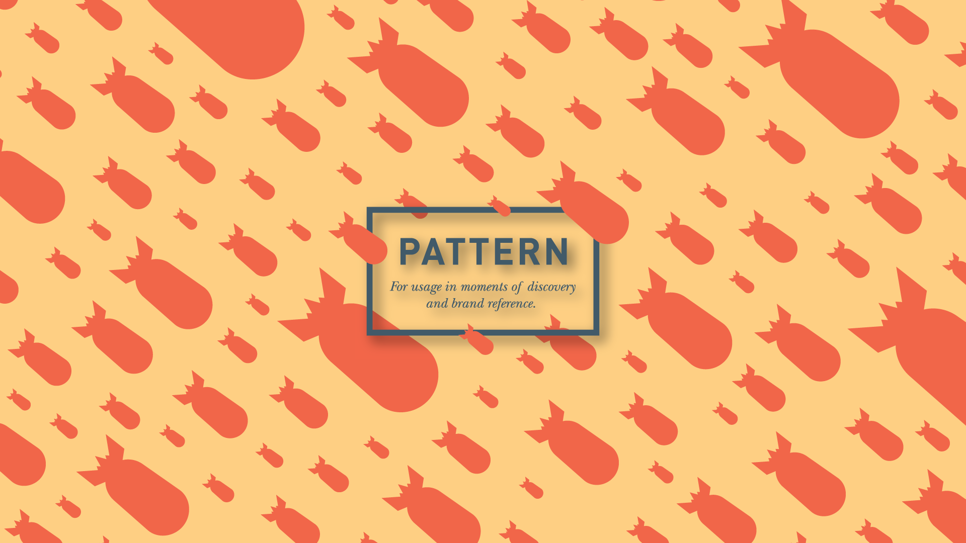
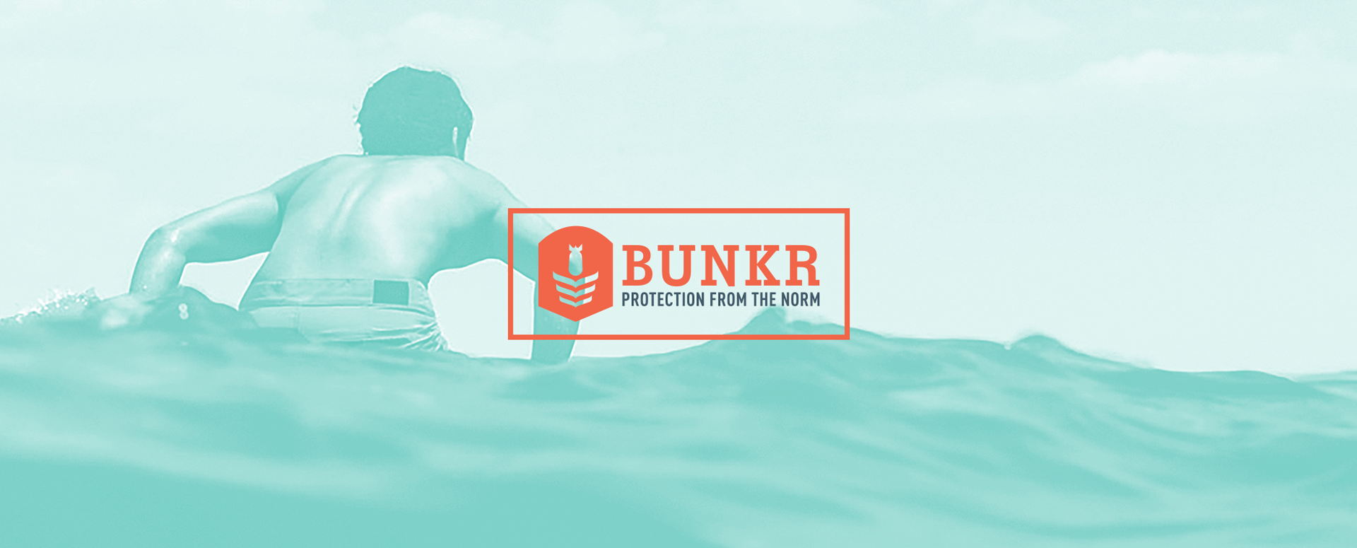
Brand Tagline
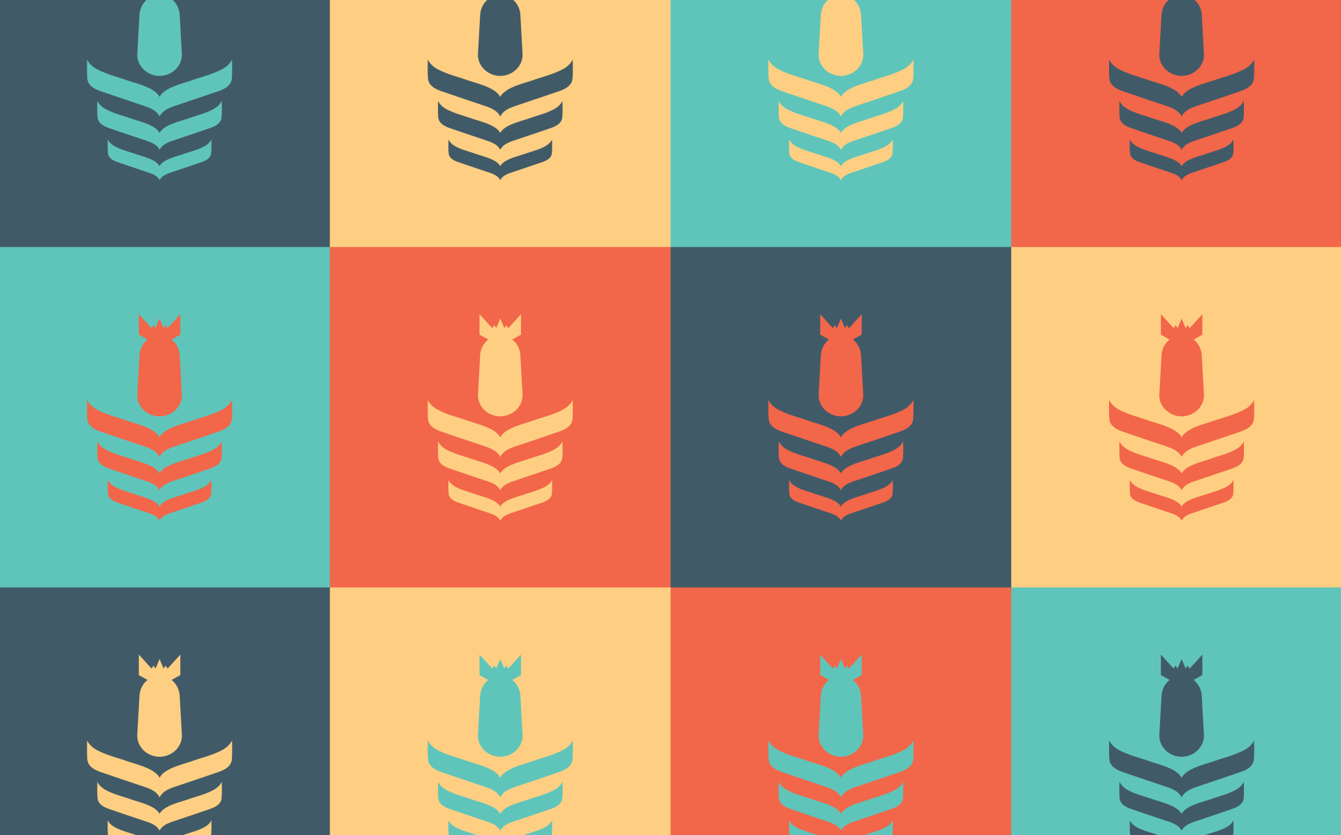
Typography
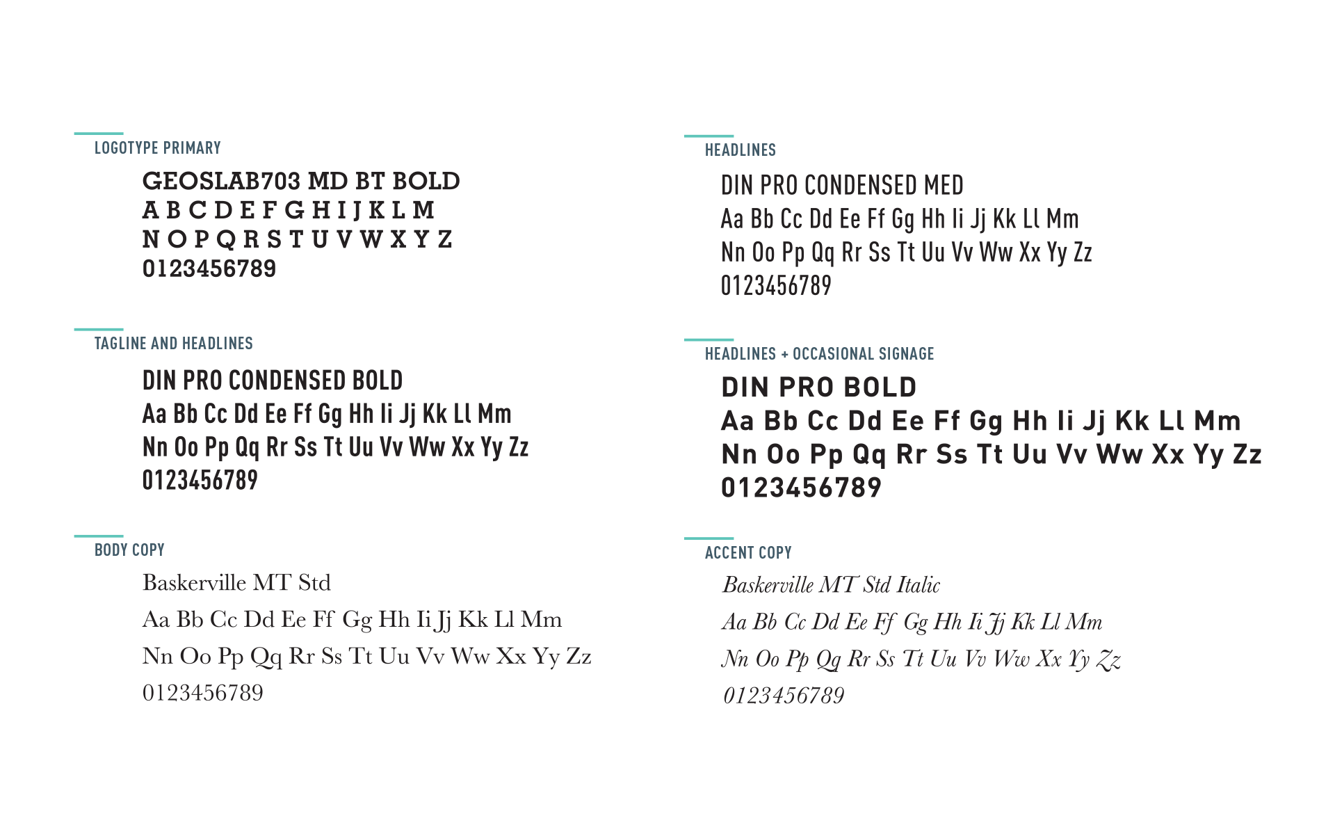
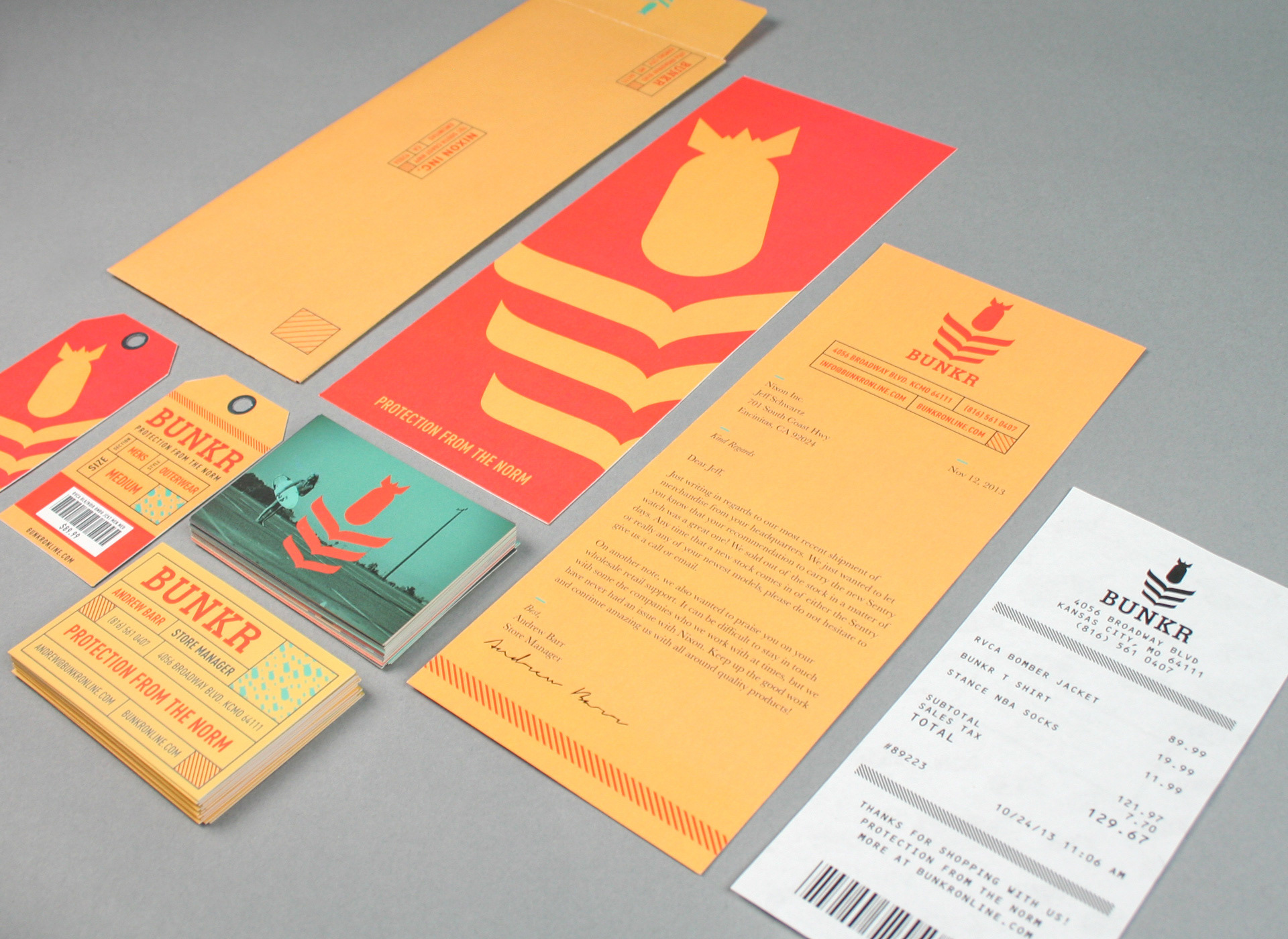
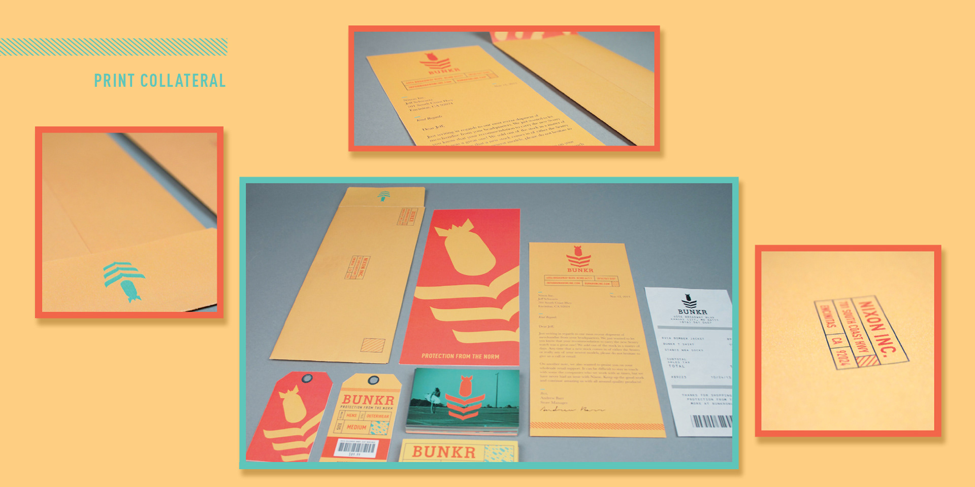
The heavy slab serif in the logotype focuses on stability and draws inspiration from vintage military stamped lettering. Din Pro in several bold and condensed weights are utilized for headlines and tag lines and contrasts the primarily slab serif. Baskerville is utilized for body copy and for accents or "moments of discovery".
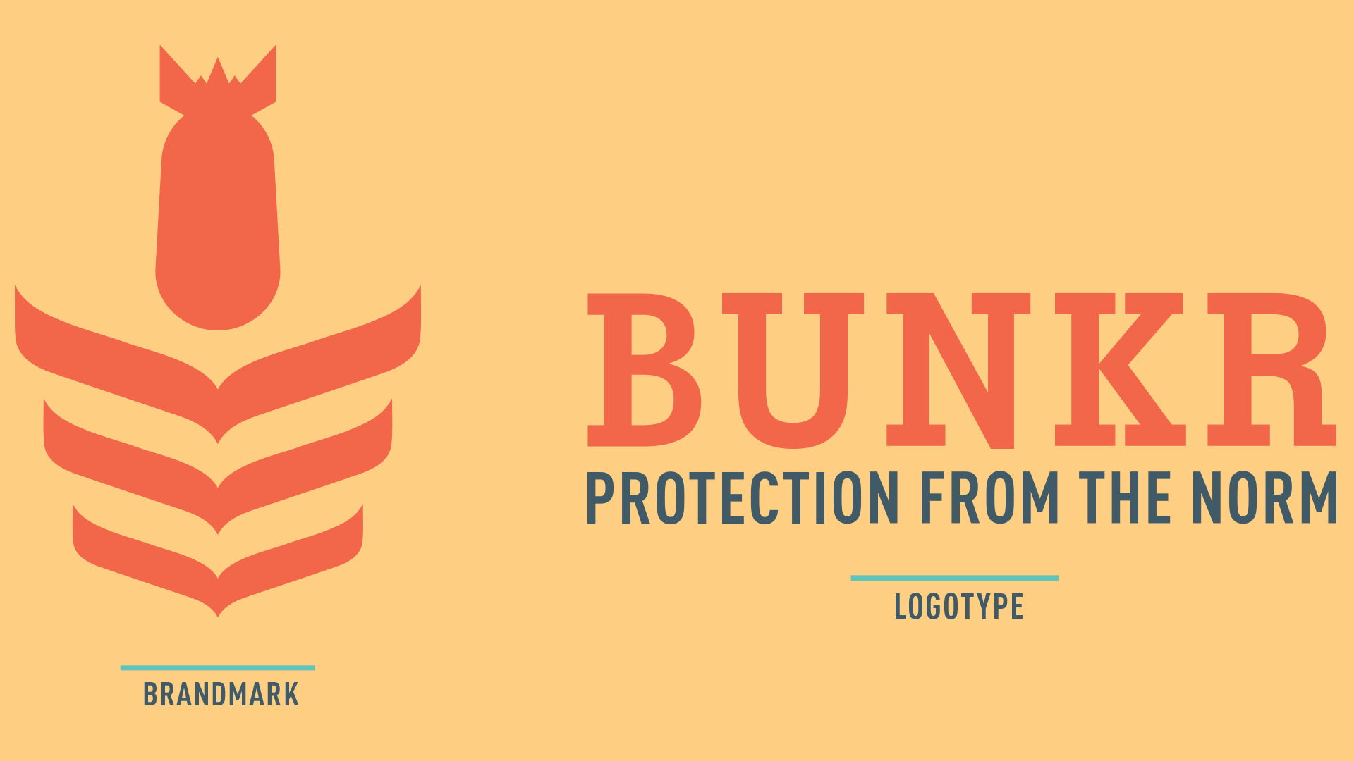
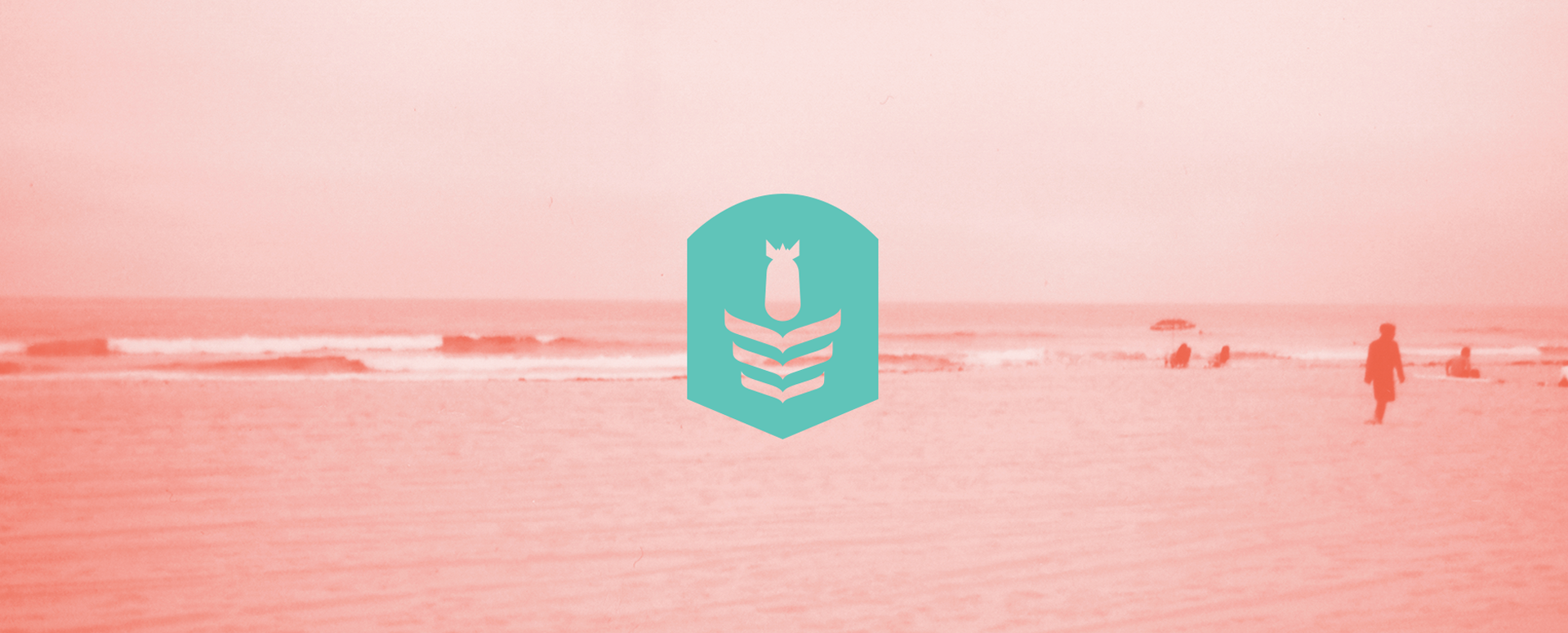
The Bomb
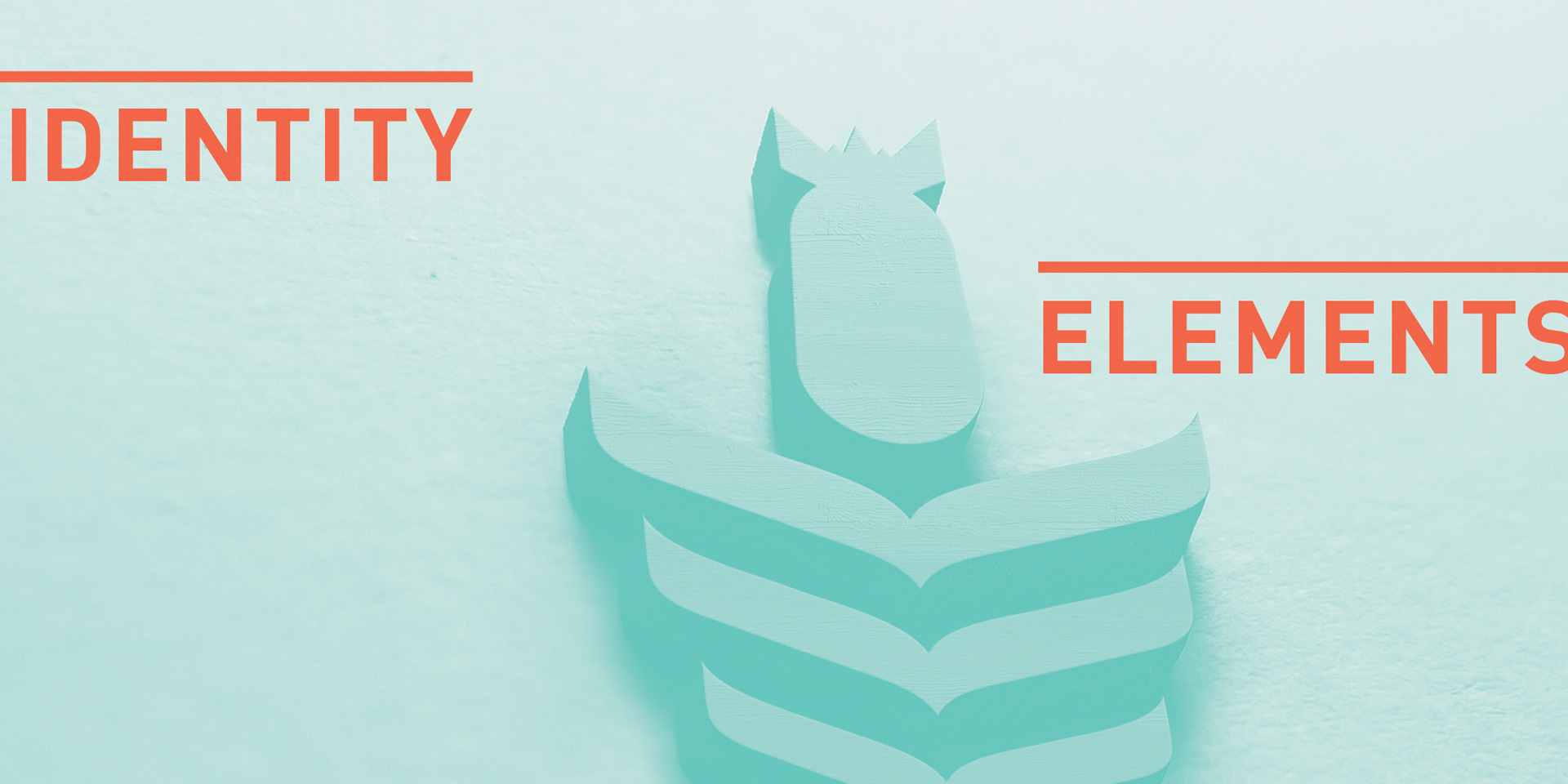
Closely associated with the military concept and what a bunker protects from. Symbolizes impact.
The Chevron
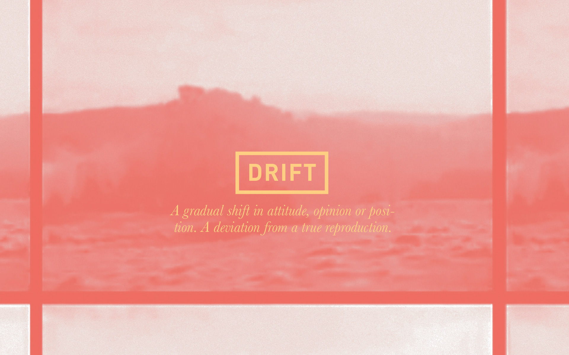
The chevron symbol is based on military rank and service, while also focusing on the drift impact of the bomb.
The Logotype
The logotype lacks the letter E, focusing on captivation and discovery and also references stamped words on military equipment, often with abbreviated titles on bags or vehicles.
The Chevron
The chevron symbol is based on military rank and service, while also focusing on the drift impact of the bomb.
The Logotype
The logotype lacks the letter E, focusing on captivation and discovery and also references stamped words on military equipment, often with abbreviated titles on bags or vehicles.
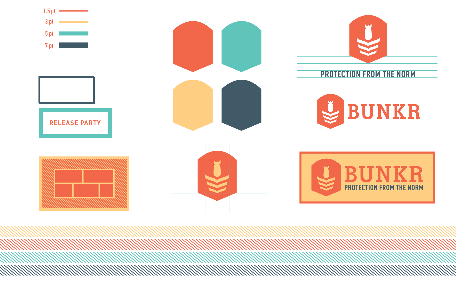
Graphic Elements
Linear elements and rectangular forms reference protection and stability and emphasize important information. A combination of the rectangular form and directional lines are used with text on image overlays for clarity and legibility. A badge grounds the mark when utilized independently.

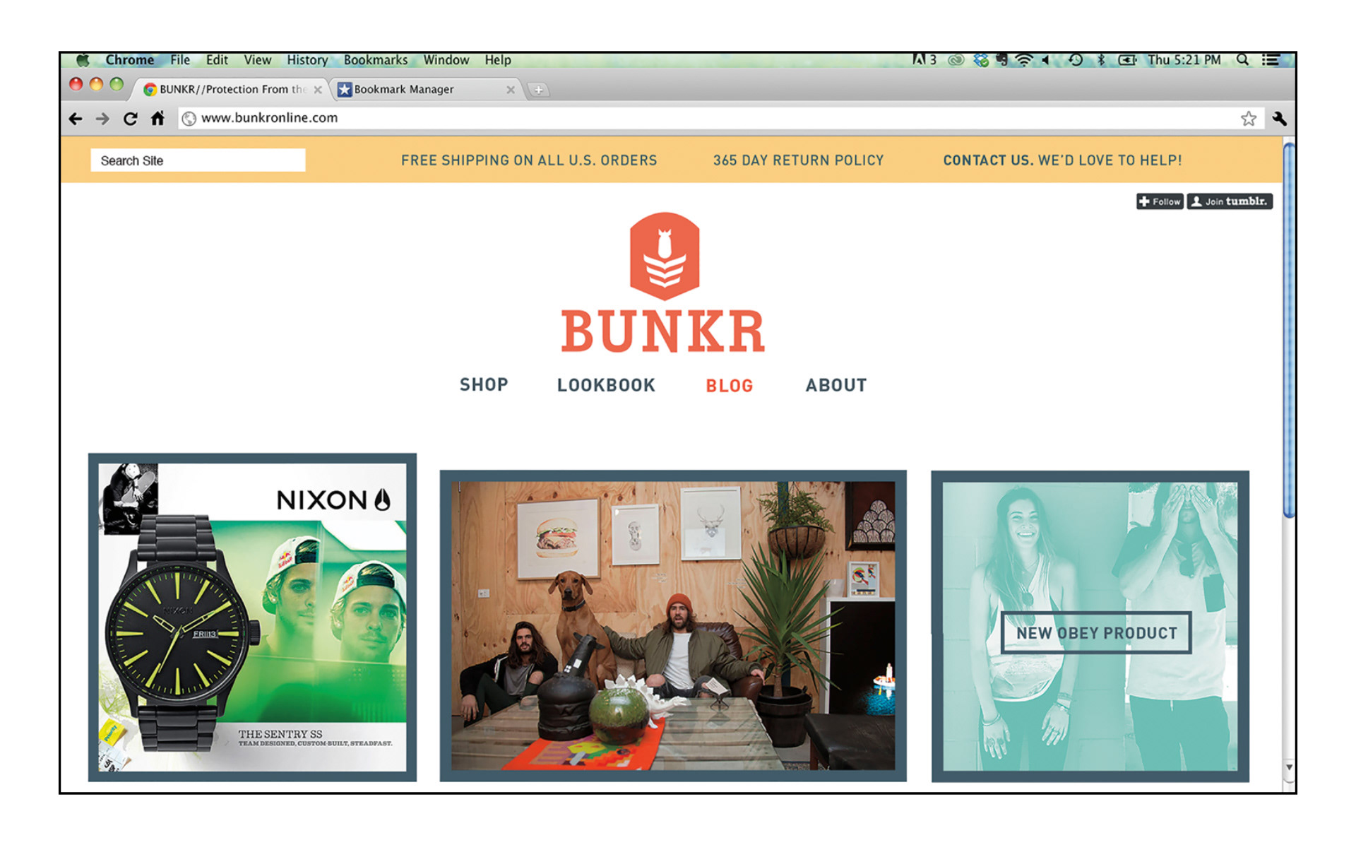
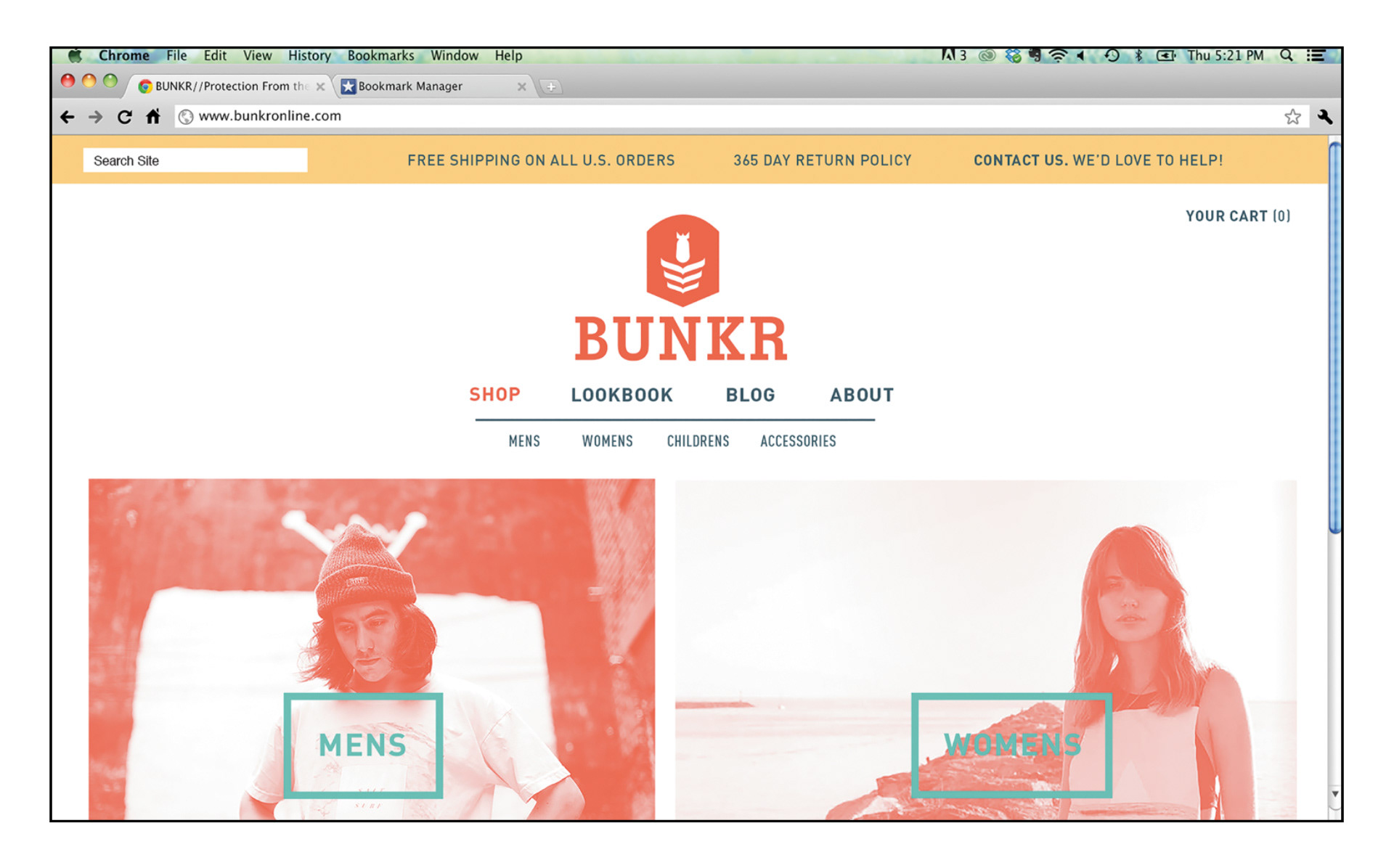
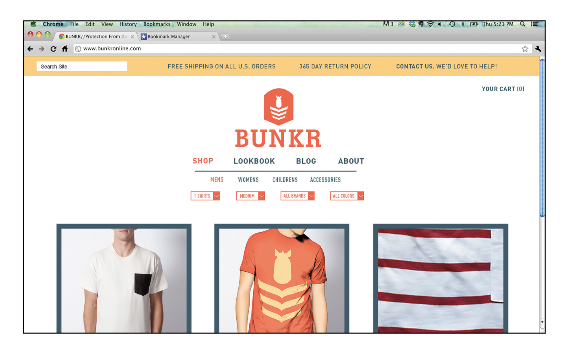
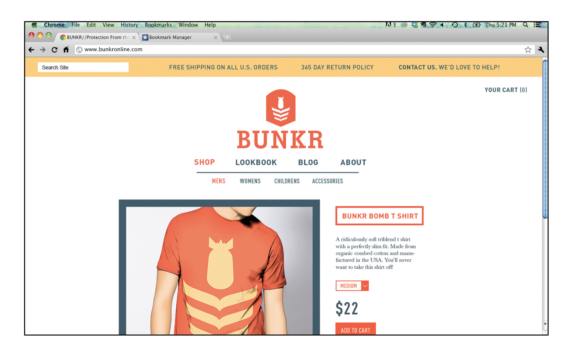
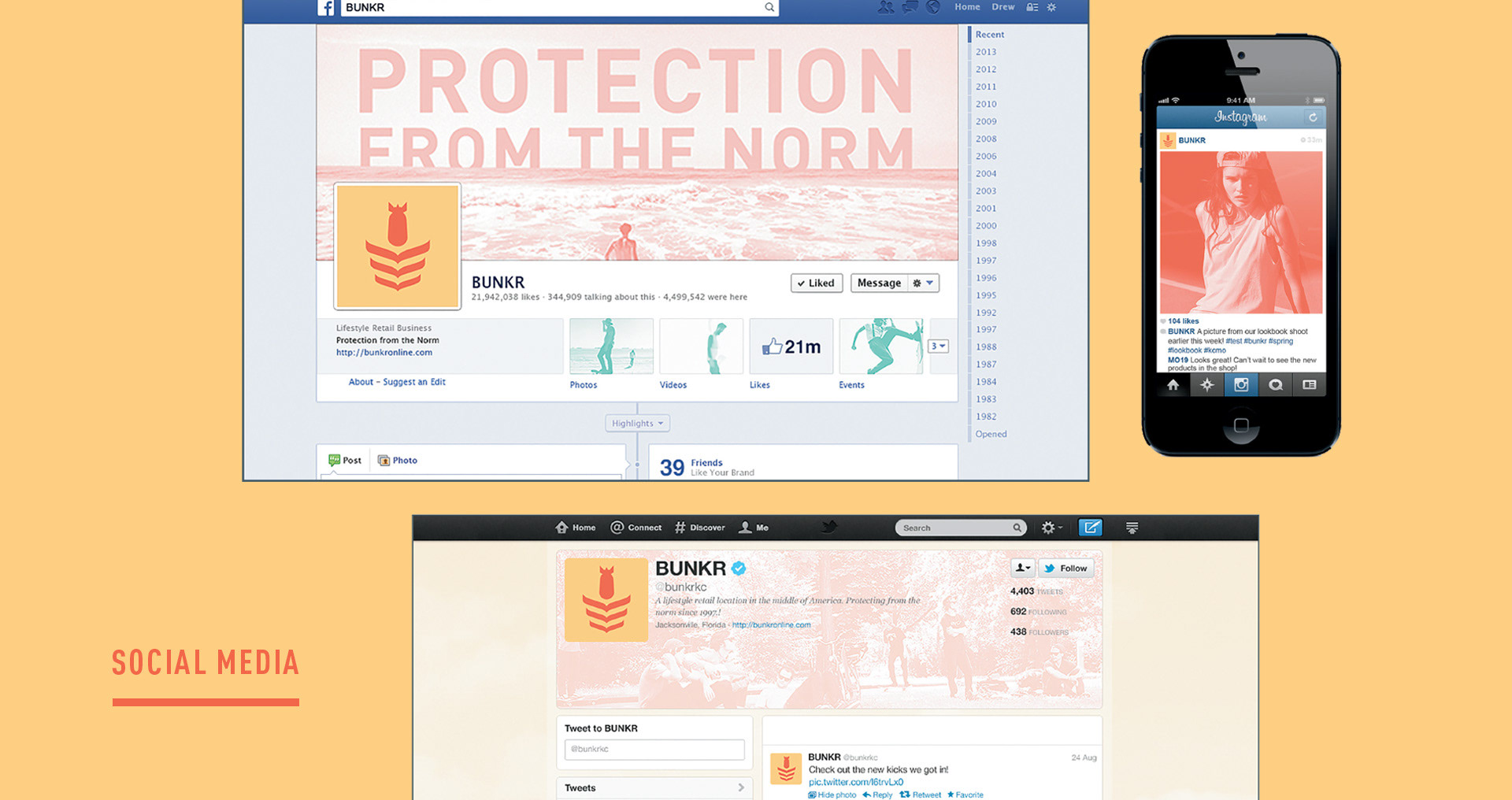
Web Experience
The website is a direct extension of the in store shopping experience. The branding is cohesive and the site opens up the line of carefully curated products to a new and much broader audience. The blog also offers a space to advertise sales or events.
Thanks for checking out my work. If you like what you see, check out my full portfolio! :)